The UX goal for online shopping
At Tin Soldier, we have vast knowledge and experience in creating high converting Ecommerce websites. This post outlines the essential elements required to improve Ecommerce UX design. UX done right provides the solid foundation for growth and development.
UX for Ecommerce
In the world of online shopping the UX goal is very clear – to help the user find a product and purchase it as simply and as quickly as possible. In other words, it’s about the overall customer experience and whether the site is a joy to use. If the user experience isn’t good, cumbersome or irritating, visitors will leave, costing your business customers, and lost revenue opportunities
To achieve a high-quality customer experience, there must be a seamless merging of multiple disciplines – marketing, graphical and interface design. Easy accessibility, creative interaction, and catering to your target audience are just some ways designers work UX design.
It always helps before starting any UX project, to take a step back and make sure you understand the desire driving the purchase. It’s about getting inside the consumers head and being sensitive to how the site will make them feel and react.
Getting the basics right
When you acquire and integrate products into an Ecommerce website, there needs to be a focus on every aspect of the design process. This includes branding, usability, functionality, and more.
Here we take a look at some of the basics.
Navigation
Navigation is critical when you have many categories and configurable products. Nothing is more frustrating than a cumbersome menu. The quicker people can find what they want, the quicker you can move them through to the checkout process. The purpose of a navigation menu is to get people where they want to go. These are the key elements that need to be considered:
Every step must be justified – there must be a reason to do this or that
Navigation logic should be obvious and easy to perform
Every element should be easily identifiable
Search
Many users skip the navigation menu altogether and rely on search/faceted search to drill down further. Faceted search can get complicated from a development and cost perspective, but also from a user perspective. Follow these guidelines to keep things simple and helpful:
Use an open text field box at the top of every page
Use faceted search when there are over 20 products within a category
Filter by price, colour, size are basic faceted search options
Search autocomplete – providing helpful ideas
Call to action (CTA)
It is important to differentiate simple navigation controls from a variety of call to action buttons. Call to action buttons need to be clearly defined, well-positioned and instantly recognisable. There are important hierarchy of elements. If CTA button is connected with the purchase it should look one way. If it presents some additional information it needs to look different. If it is a special offer, yet again another design. Customers need to be able to instantly differentiate. If done right, CTA will map out the customer experience and in turn raise conversion rates.
Mobile-first
Mobile-first design isn’t a new trend but it is still the single most important change in user experience since the early days of the web. With mobile commerce increasing, designers must to consider different sized screens on a multitude of different devices.
Product Imagery
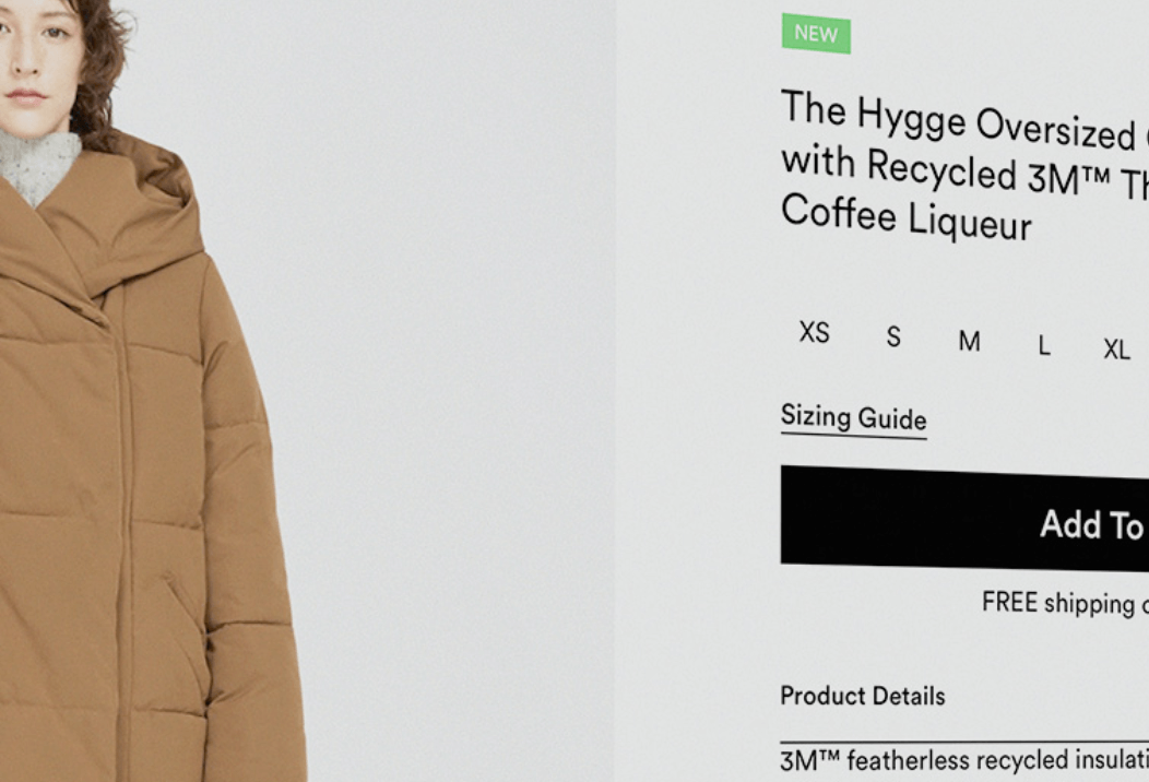
Great product photography is essential for convincing consumers to buy products. Consumers ae looking for stimulating and interactive shopping experiences. Having simply product photography is not enough. Use big, high quality images to showcase products to their fullest. Adding 360°products photos and zoom functionality to expose finer details are great ways to give the viewer the additional confidence needed when purchasing online.
Personalisation
Personalisation is one of the biggest trend in ecommerce right now. From previous browser behaviour and purchase history, to time and location of browsing and items abandoned in the cart, brands are able to build-up a detailed picture of each customer and streamline their content and recommendations to suit their shopping habits. Simple and effective ways you can apply personalisation include; personal product recommendations, display related and complimentary products, let customers personalise products and allow customers to set their marketing preferences.
Social proof
Consumers value the opinion of others. Nielson research shows 92% of people will trust a recommendation from a peer and 70% of people will trust a recommendation from someone they don’t even know. Make sure social proof messages are threaded throughout your site. This means placing reviews, endorsements and testimonials and throughout the shopping journey.
Chatbots
When buyers need help with their shopping experience online, they rarely want to have to pick up the phone. This has led to an increase in the use of chatbots. Chatbots create an easy solution to this problem. When a customer needs to ask a question, chatbots can deliver the answer in seconds. Today, their main use is for basic customer support. They are programmed to respond to common questions a buyer might ask during the purchase process. We can only expect chatbots to advance and their use to become even more popular.
In conclusion
UX design is one of the defining factors in a successful development of an Ecommerce store. It shapes the way the platform is used at every stage – from initial overview to the purchase process. UX done right provides the solid foundation for growth and development.
To discuss your online business and how we can help you with UX Design, give us a call at Tin Soldier.
