A refreshing brand experience for award-winning wine.

Client
- Babich Wines
Services provided
- Planning & consultation
- UX/UI design
- Web development
- Ongoing support & maintenance
Platforms used
- WordPress
- WooCommerce
The challenge
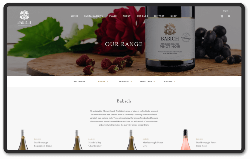
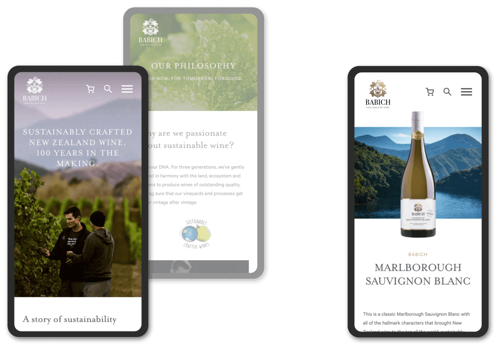
Babich wanted to overhaul the site architecture and layout to allow their international users to experience the majestic New Zealand backdrop where their wine is made. A key area to focus on was bringing together their wine information pages and product pages, which sat separately on the site and weren’t linked in any way.

What we did
We redesigned the page templates to showcase their beautiful selection of wines and the breath-taking landscapes in which the grapes are grown. We created a new wine product page template that gave users access to all the relevant information on the wine, as well as allowing them to purchase a bottle or two right there.
The results
Since the new website went live, pageviews dropped by nearly 10%, but unique pageviews and average time on page rose by 3% and 24% respectfully. This showed us that users were having a better experience with the site; finding the information they wanted and spending more time with the website without going back and forth between pages.

